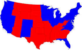
The division of America by an election seems greater when rendered only in red and blue and by state, as we are accustomed to seeing:
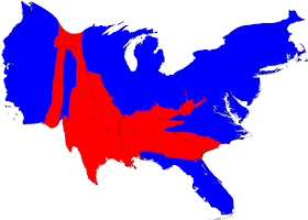
The well-known distortion of the above map is the illusion caused by the size of the states and the concentration of population. When a map is turned into a cartogram, sizing the states by population, this is the result:
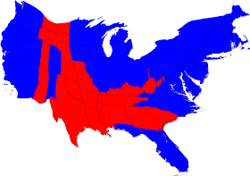
The election results that matter, the votes in the Electoral College, produce a slightly different map:
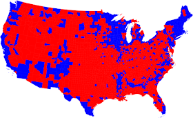
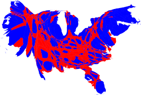
We get even closer to representing the urban-rural divide by displaying the results by county. The first map is like the state map above, simple red and blue; the second is a cartogram, based on the population of the counties.
However, mere red and blue obscure the fact that many counties were closely decided. If you use purple, and vary the three hues depending on the vote, you get a clearer picture:
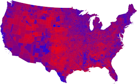
As a cartogram, the counties get pretty muddled:
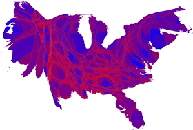
Better: When the color scale ranges from red for counties that went at least 70 Republican, to blue for those that went at least 70 percent Democratic, the picture becomes clearer:
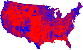
"This is sort of practical, since there aren't many counties outside that range anyway, but to some extent it also obscures the true balance of red and blue," writes
Mark Newman of the Department of Physics and Center for the Study of Complex Systems at the
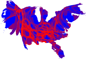
University of Michigan, who did these maps. Here is the 70-percent map as a cartogram:
For larger versions of these maps, and Newman's more detailed explanations,
click here.
 The well-known distortion of the above map is the illusion caused by the size of the states and the concentration of population. When a map is turned into a cartogram, sizing the states by population, this is the result:
 The election results that matter, the votes in the Electoral College, produce a slightly different map:
 We get even closer to representing the urban-rural divide by displaying the results by county. The first map is like the state map above, simple red and blue; the second is a cartogram, based on the population of the counties.
 However, mere red and blue obscure the fact that many counties were closely decided. If you use purple, and vary the three hues depending on the vote, you get a clearer picture:
 As a cartogram, the counties get pretty muddled:
 Better: When the color scale ranges from red for counties that went at least 70 Republican, to blue for those that went at least 70 percent Democratic, the picture becomes clearer:
 "This is sort of practical, since there aren't many counties outside that range anyway, but to some extent it also obscures the true balance of red and blue," writes Mark Newman of the Department of Physics and Center for the Study of Complex Systems at the University of Michigan, who did these maps. Here is the 70-percent map as a cartogram:
 For larger versions of these maps, and Newman's more detailed explanations, click here.
No comments:
Post a Comment