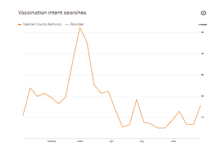
It's easy to find your locality's coronavirus vaccination rate, but what about its vaccine hesitancy rate, or local interest in vaccination? Two new interactive tools reveal those numbers. One uses data gathered by polling done through Facebook; the other shows the relative interest in vaccination shown by online searches.
The Facebook-gathered data are in interactive maps from the University of Washington, showing what counties (and even what Zip codes) are most hesitant to get a shot. The maps by the university's Institute for Health Metrics and Evaluation reflect answers to this question: "If a vaccine to prevent Covid-19 were offered to you today, would you choose to get vaccinated?" The answers are "Definitely," "Probably," "Probably not" and "Definitely not." People giving one of the last three answers are considered vaccine-hesitant.
The maps do not break down the data by individual answers, but are interactive, and can be switched to show the percentage of people saying "Probably" and "Probably not." That allows simple subtraction to produce the "Definitely not" figure for each area.
Another tool, called Google Covid-19 Vaccination Search Insights, uses aggregated, anonymized data from Google searches about vaccination. The weekly data are available by region and by county.
The trends reflect relative interest, broken down three ways: overall interest, vaccination intent, and safety and side effects. Click here to learn more about how the researchers process the data.
 |
Google graph shows searches in Spencer County, Kentucky, June 21-28.

No comments:
Post a Comment